


(click image to view full-size)
Sources for Inspiration


(click image for larger size)
also available for download in Carmen


Tools for Visualization
Remember, it's not at necessary to be an amazing graphic designer or artist to create a compelling visualization. What is necessary are some fundamental rhetorical skills, like knowing your purpose, analyzing your audience, and basic visual literacy.
Here are some ways to create your visualization project. Experiment by mixing and matching--print a chart and draw around it, mess around with a scanned picture in Word, etc.

Paper, pen, pencil, sharpie, scissors, tape, ruler, photocopier = all the elements needed to pull together some information in a stunning visual package. If computers scare the hell out of you, use the tried-and-true techniques.
For example, you can rip pictures out from a magazine and reshape them into a graph by using a ruler and basic math. Stick figures are used in digital design all the time because their simplicity is effective. Always keep in mind that the goal is create something worthy of mass circulation, so construct with a photocopier in mind.

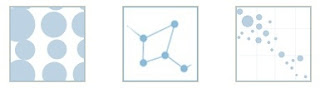
If you're working on the 2007 for Windows or 2008 for Mac, the Insert Chart options are vast:

They've got bar, bubble, line, pie, scatter, and so on. Remember to keep the rhetorical principles in mind when choosing which chart is the best--reflect on why that chart is better than another one.
AutoShapes are also low buy-in and high pay-off. Head to Insert again, then look for Picture; you should see an option for AutoShape. (This is also the area to bring in other files: just select Other Files.) You've got a wide range of shapes to choose from, which you can then manipulate to change the size, color, or general shape:

If you get frustrated with how the computer is shaping them, try printing a few out and going cut and paste style. But also remember that learning new skills is valuable, even if a bit annoying at times.
The 'SmartArt' graphics are very cool and manageable--these are perfect for argument mapping, as they allow you to insert text into the shape, change charts even after you've started working on one, and change individual box size. If you're on a PC it will probably look something like this:


The best way to get to know these tools is to simply play around with them for a few minutes. Click around and explore the different options available, testing out possibilities before getting to the task of your own visualization. The ability to control general design and color allow for you make distinctions between elements rather easy--look for the toolbar options in the formatting palette:

Use this project to learn a new set of computer skills that could prove useful down the road. You can watch a video tutorial of SmartArt here.
GraphJam is construct good-looking charts with low-threshold technology:


ManyEyes is an amazing website that allows you to either upload data or search through the data that's already there. You can then choose amongst an array of professional looking visualization graphics.
When you're on the frontpage look for Create Visualization under the Participate heading. To see what kind of options are available, I would suggest using an existing data set, but if you'd like to create your own, it's a good idea to upload.


But I think the coolest part of ManyEyes is their mapping function, which can depict data by country, state or even counties within a state! Here's one example of a visualization that used their preformulated map of the US:


Use this project to learn a new set of computer skills that could prove useful down the road. You can watch a video tutorial of SmartArt here.
GraphJam is construct good-looking charts with low-threshold technology:

ManyEyes is an amazing website that allows you to either upload data or search through the data that's already there. You can then choose amongst an array of professional looking visualization graphics.
When you're on the frontpage look for Create Visualization under the Participate heading. To see what kind of options are available, I would suggest using an existing data set, but if you'd like to create your own, it's a good idea to upload.

The site can accurately render a bubble graph, treemap, or block chart -- visual representations that are difficult to do without professional software:


But I think the coolest part of ManyEyes is their mapping function, which can depict data by country, state or even counties within a state! Here's one example of a visualization that used their preformulated map of the US:

Another option for those who have some background in computers is Photoshop. I suggest this option only if you've had previous experience with the software, since it's not very intuitive, in my opinion.
